Documentation Index
Fetch the complete documentation index at: https://www.recraft.ai/docs/llms.txt
Use this file to discover all available pages before exploring further.
More Beautiful by Nature
Beautiful images don’t happen by accident. Neither does V4.1. V4.1 is the upgrade you didn’t know you were waiting for. Images feel more alive, more purposeful, and more natural. The photorealism is quieter and more realistic. New illustration styles are now possible that simply weren’t before. And this model can read a short prompt and get the aesthetic right, all without the instructions of War and Peace to get there.
Photorealism That Actually Looks Real
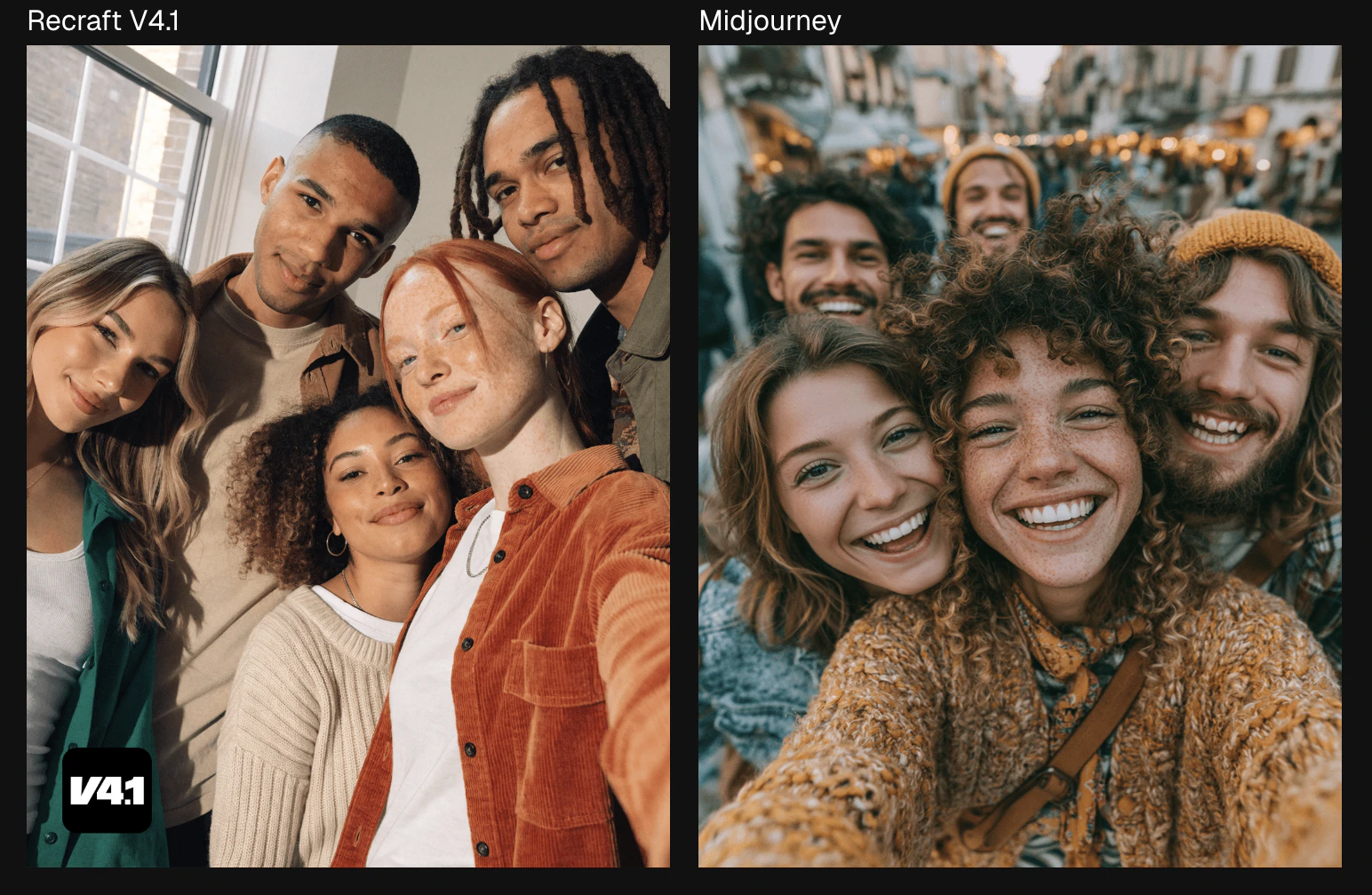
PROMPTV4.1 understands people. In the group selfie above, it looks warm, diverse, and genuinely candid. There’s less noise in the background. You can count on more natural photos, not just of the people themselves, but of the background as well. No more random urban backgrounds unless you specifically ask for it. Midjourney produces a beautiful photo here, but it delivers a lot more than “warm authentic atmosphere.” The fuzzy, busy outdoor background has a life of its own.
Group selfie of friends standing close together, softly smiling with natural relaxed expressions, casual lifestyle photo, warm authentic atmosphere, modern youthful aesthetic, realistic lighting, candid social moment.
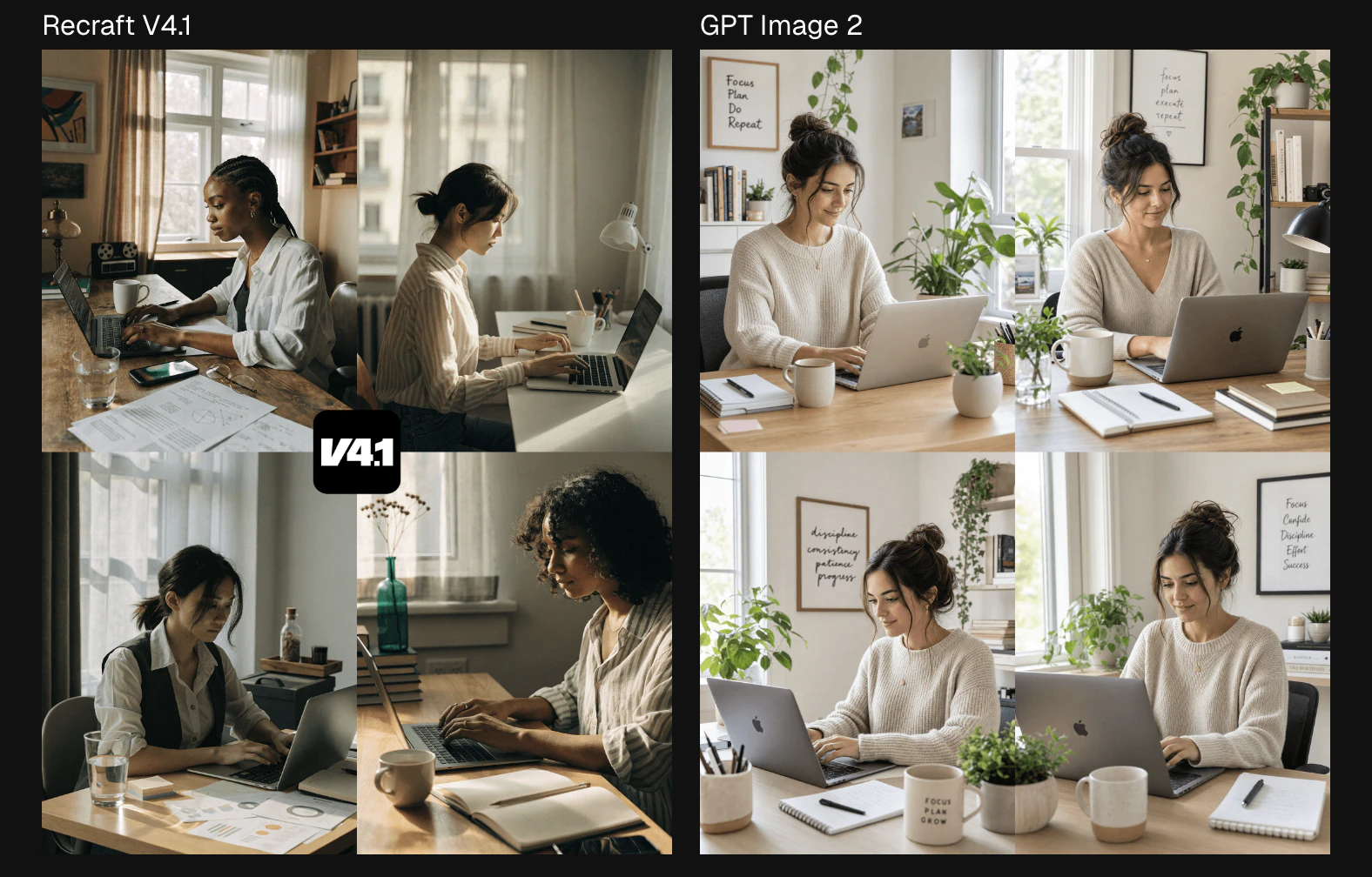
PROMPTThe difference holds up even in quieter settings. In the comparison above, the GPT Image 2 model generated a busier background that feels more like a stock photo than a real home. They might as well have put “Live, Laugh, Love” on one of those posters. The subject also has that slender, slightly Disney-coded face that the model defaults to. A nice picture? Sure. Realistic? Not quite. V4.1’s image feels lived in. The desk is warm, a little messier, and real. V4.1 photorealism is built for images that need to feel human. It’s beautiful in the way that real life is beautiful.
Working on a laptop, desk setup, soft daylight
Shorter Prompts, Better Results
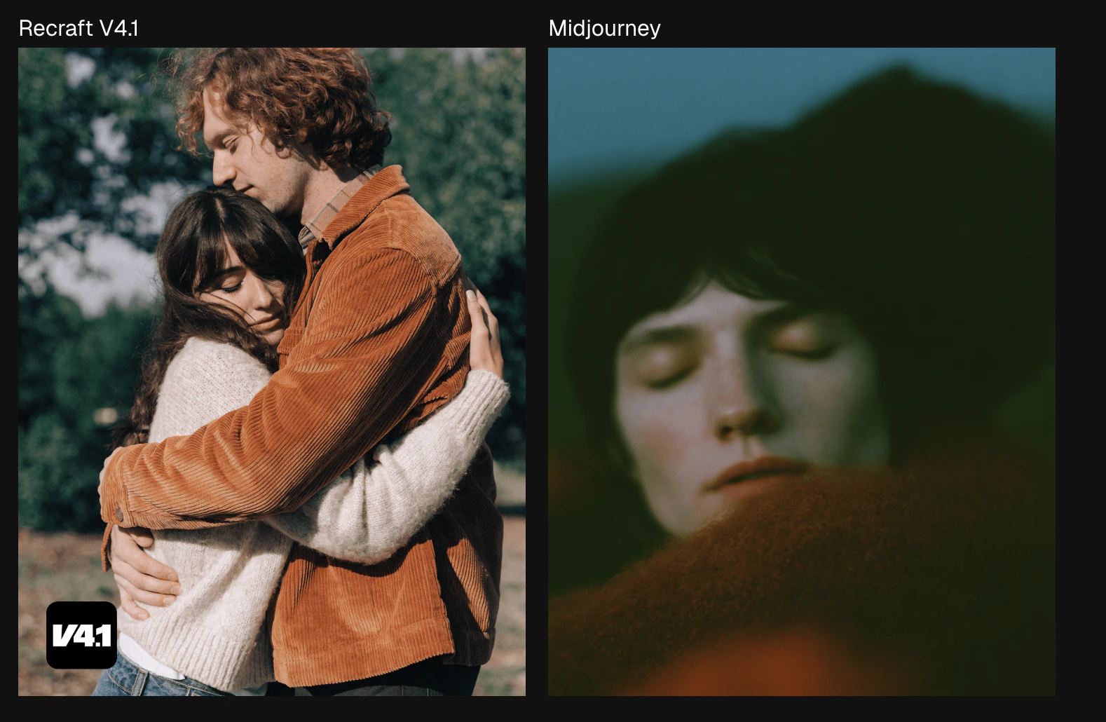
PROMPTIn this prompt, each model had only three words to get things right. V4.1 understood the assignment. The result is warm, intimate, and emotionally specific. It created a portrait photo of two people hugging with golden hour light that looks like a real couple photoshoot. Midjourney got the memo, but it went in a very different direction. It looks more like a first-person artistic view of a hug, not so much a photo of a couple in a tight hug.
Couple tight hug
PROMPT
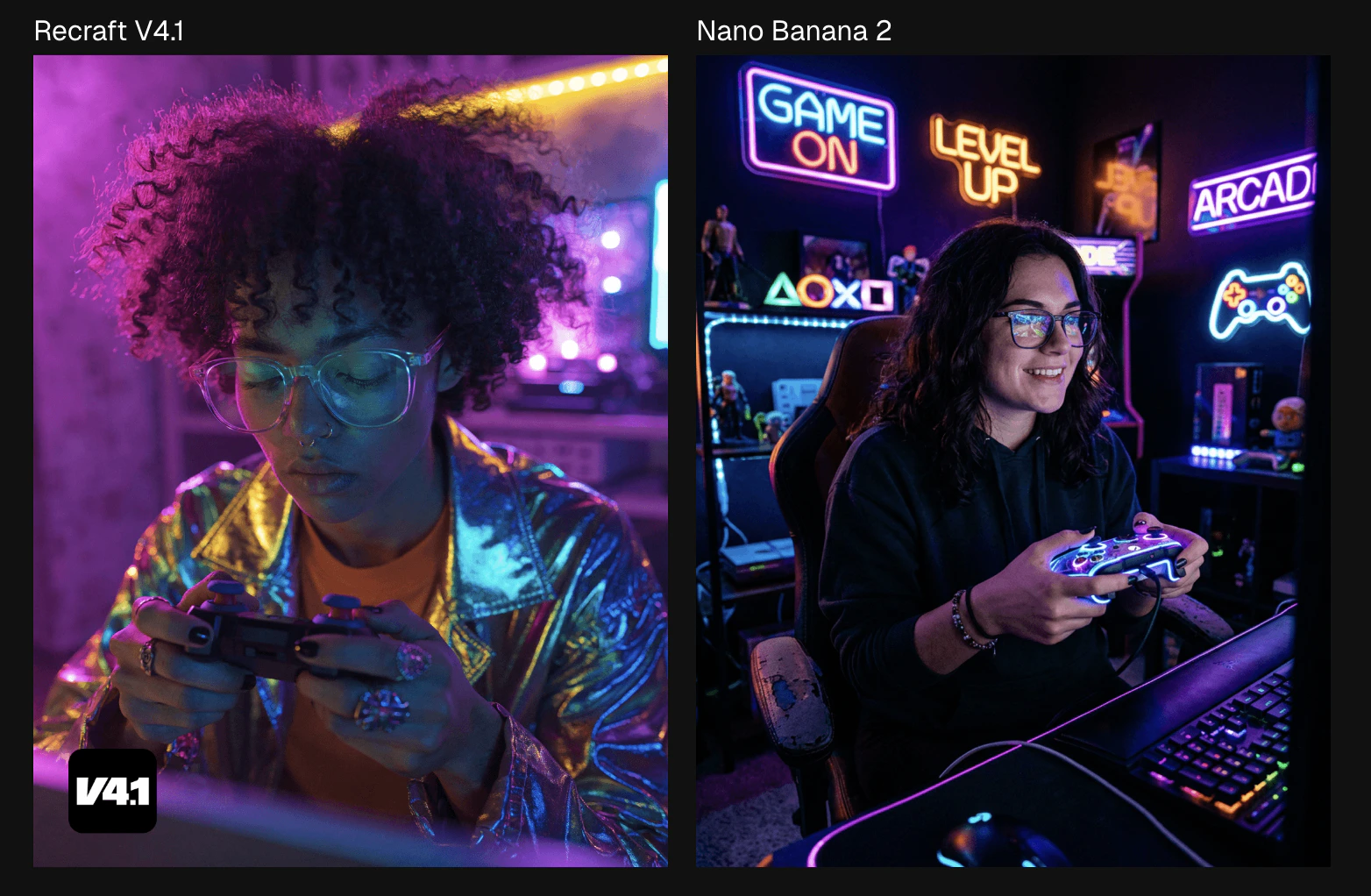
Playing with a game controller, neon light
V4.1 reads short prompts the way you’d imagine a creative director would. It fills the gap with taste instead of filling the frame with duplicates of things that no one asked for. With this prompt, Nano Banana 2 really goes all out with the “neon light” instructions, adding multiple neon signs to fill the background.
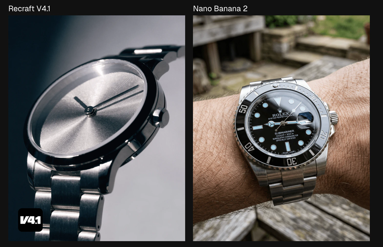
PROMPTIn five words, Recraft read the room. The result is a sleek editorial shot with its dramatic angle and brushed metal catching light the way it does when a photographer with real taste is behind the camera. The competitor also produced a close-up photo of a wristwatch. On someone’s wrist. On a park bench. Technically correct, aesthetically somewhere else entirely. Give V4.1 just a few words, and it’ll give you something worth keeping.
Wristwatch, metal and glass, close-up photo
Otherworldly 3D Design and Smoother Gradients
Vector and Illustration, Done Right
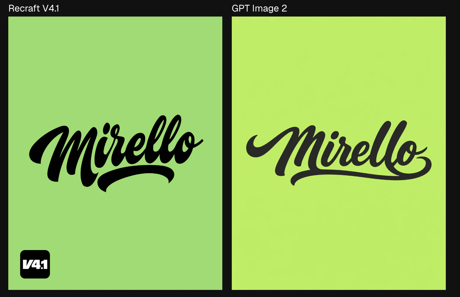
Prompt Handwritten-script vector logo, single centered lockup, wordmark only. The word “Mirello” rendered in expressive brush-script lettering — fluid strokes, natural ink variation in stroke weight from thick downstrokes to hairline upstrokes, slight baseline bounce for a hand-lettered feel, generous swash on the opening “m” and a looping tail on the final “o” that underlines the full word. Closed letterforms with clean interior counters, no rough edges or texture. Strict two-color palette: charcoal black on green. Flat fills only — no gradients, no shadows, no drop effects, no outlines around the letterform. Compact horizontal lockup with even optical spacing. Scalable silhouette with strong legibility at small sizes. No decorative elements, no frames, no secondary text.Text and illustration is where taste really shows. V4.1 has plenty of it. The V4.1 image is bolder, more expressive, and features a strong underline sweep that draws attention to the logo. The GPT Image 2 model is softer and more timid. The M loses its swagger and drama. GPT plays it safe. The letters are correct but lack conviction. It’s the difference between a logo that commands attention and one that politely requests it.
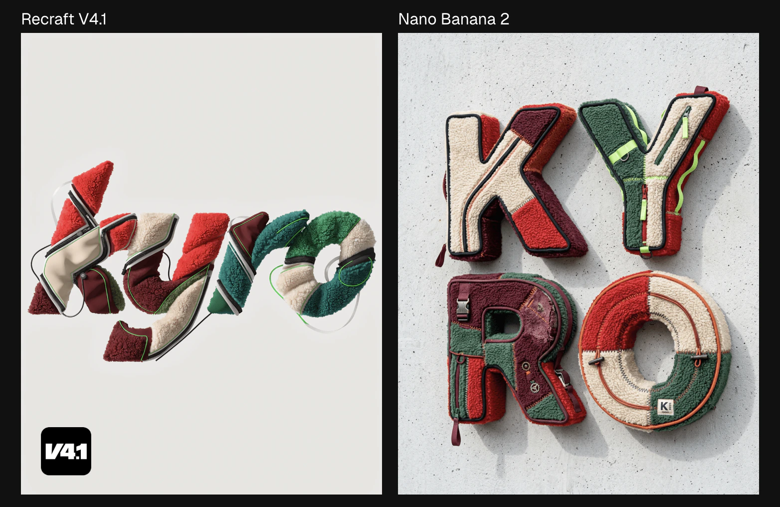
PROMPTEven when the prompt isn’t as simple or straightforward, V4.1 makes sure that image is clean. With this kyro typography, the V4.1 model makes it sit flat on a light gray background, every letter structured and intentional. Nano Banana 2’s version is textured and photographic, which looks impressive until you try to use it. It is plastered on a concrete wall at an angle and is difficult to understand. It doesn’t look like something you’d bring to a exploration or brainstorming session. The V4.1 version, however, definitely belongs on a Pinterest board for someone’s future fleece jacket business.
Experimental typography spelling “kyro” made from fragmented sherpa fleece jacket panels, red, cream, green, and burgundy palette, sculptural textile letters with visible seams and piping, futuristic sportswear aesthetic, light-grey background, ultra detailed
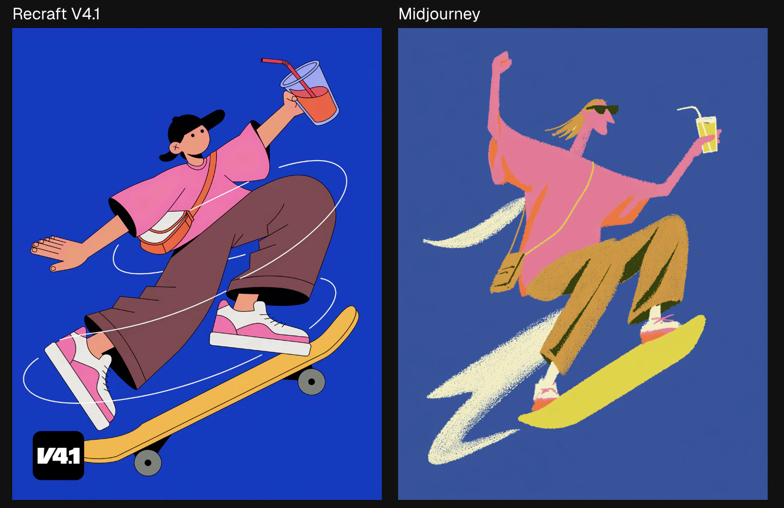
PromptThe skater image is where V4.1’s illustration quality really shows its hand. V4.1 gives you bold color fills, precise shapes, and a composition that feels alive. Midjourney’s version brings energy, but it loses the elegance with rougher lines and less consistent fills. One of these looks like a finished piece. The other looks like a first draft.
A playful flat vector illustration of a skater captured mid-trick in a dynamic airborne pose against a solid saturated blue background. The character has exaggerated proportions and a bold stylized design, wearing a pink oversized T-shirt, loose brown pants, white-and-pink sneakers, and a small crossbody bag, while riding a bright yellow skateboard with simplified graphic details. One arm is raised holding a drink, the other balances the motion, and curved white swooshes wrap around the figure to emphasize movement, speed, and impact. The illustration uses clean shapes, minimal facial detail, smooth flat color fills, and a vibrant high-contrast palette that feels youthful, energetic, and contemporary. The overall image should feel fun, graphic, and full of personality, blending street culture, motion, and modern character illustration in a bold poster-like composition. Style notes: flat vector illustration, skateboarding character, exaggerated pose, bold color blocking, playful street aesthetic, clean shapes, dynamic motion graphics, contemporary poster feel.
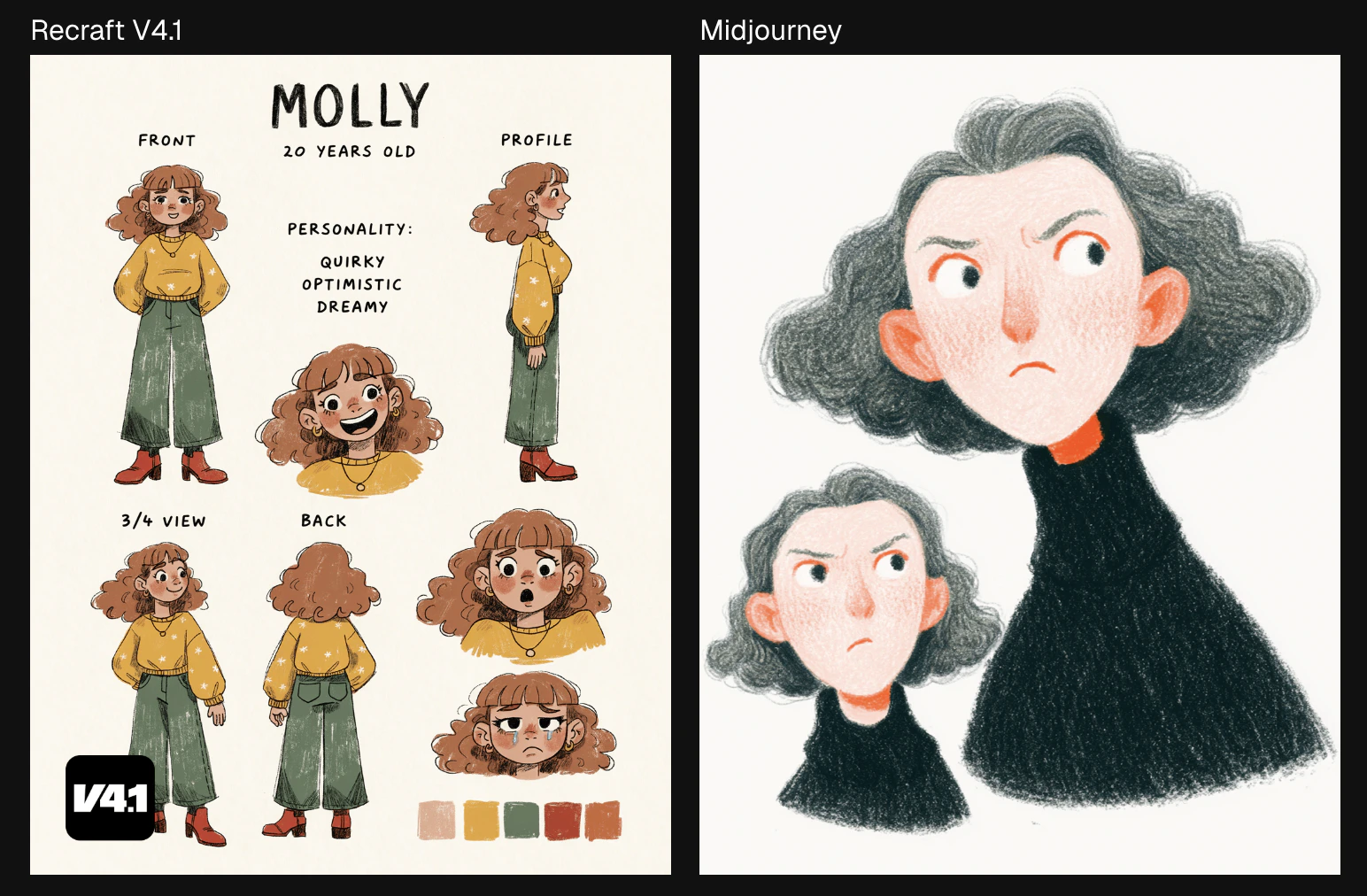
PROMPTThe character sheet is the most telling comparison of all. V4.1 creates a proper reference sheet with a front, profile, back, and 3/4 view, as well as adding character notes and color swatches. It looks like something an art student or anime fan would doodle. Midjourney draws a character. But Recraft brings one to life.
a hand-drawn character reference sheet with consistent identity
The Full V4.1 Family
Recraft V4.1: Where It All Starts
V4.1 is the main model, and the most expressive one. It brings its own point of view to every prompt. It experiments with light, mood, and composition the way a good creative director would. It’s built for exploration and concepting, for artistic self-expression, and for anyone who wants the model to bring something unexpected to the table. Give it a direction and it’ll take you somewhere beautiful.V4.1 Vector: Sleek Illustrations and Text
V4.1 Vector is built for work where beauty lives in the line. Logos, typography, and illustrations are all crafted with the kind of precision and intention that makes the image feel created rather than generated. It understands lettering, it understands form, and it knows when something looks right.V4.1 Utility: Built for Simplicity